Visualize
Visualize will provide different types of visualizations/graphs to analyze the data. You can select several chart types (bar, area, pie, heatmaps), counter, gauges, geolocation maps, among several other options.
Create Visualizations
One simple way to create visualizations is directly from the Discovery page. Just select any non-number field from the list of Available Fields on the left side of the screen to see a quick list of the top 5 values of the field.
You can for example search and select the backend_status_code field:
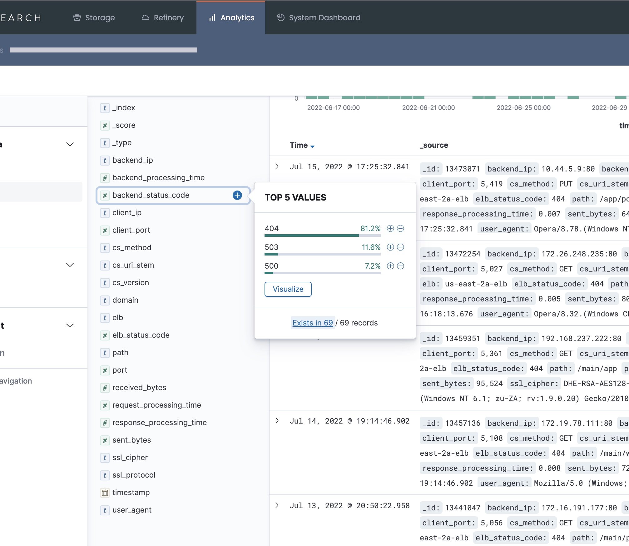
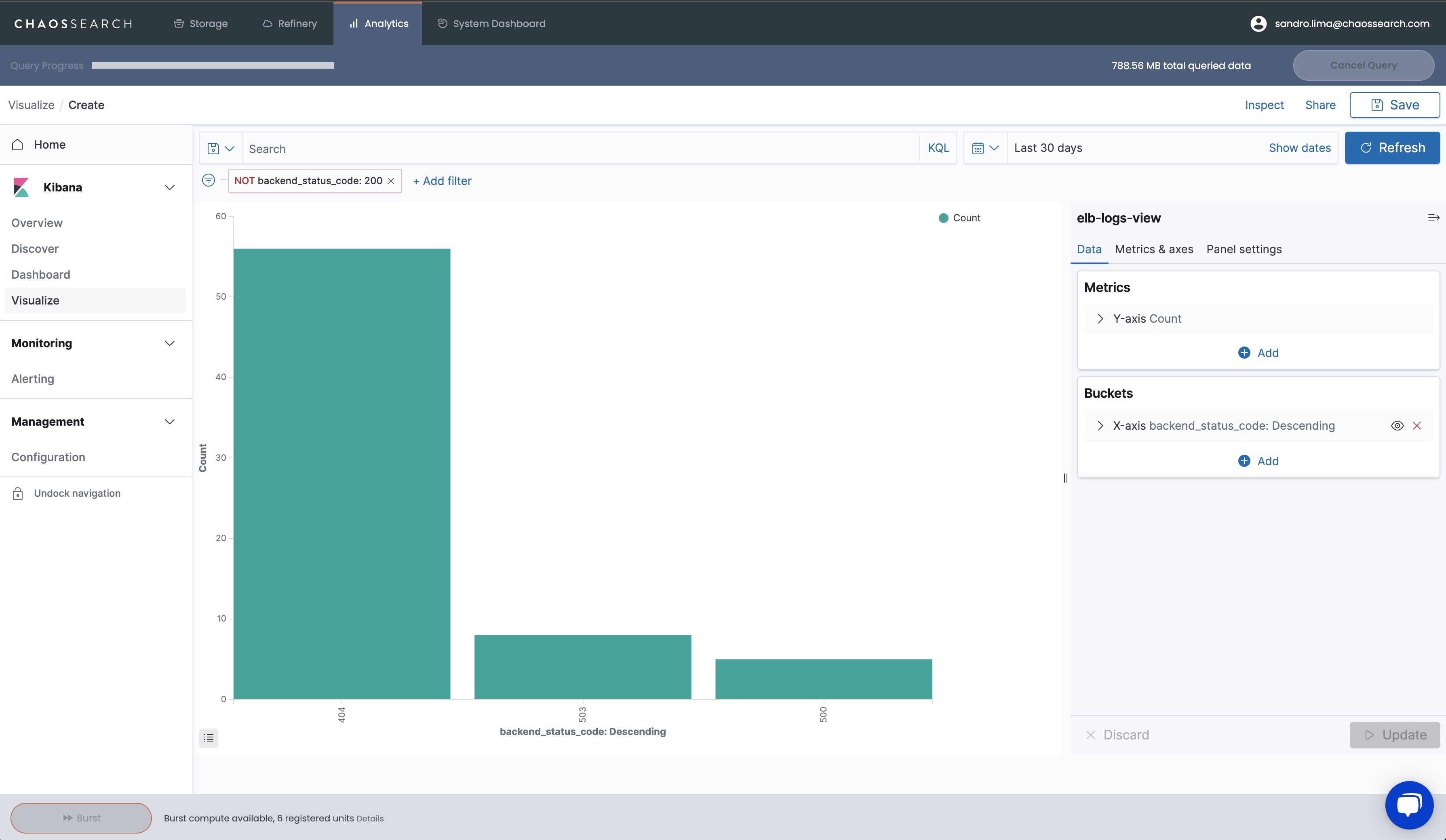
Then click on Visualize button to create a visualization for this field. Kibana creates a quick bar chart based on the field backend_status_code:
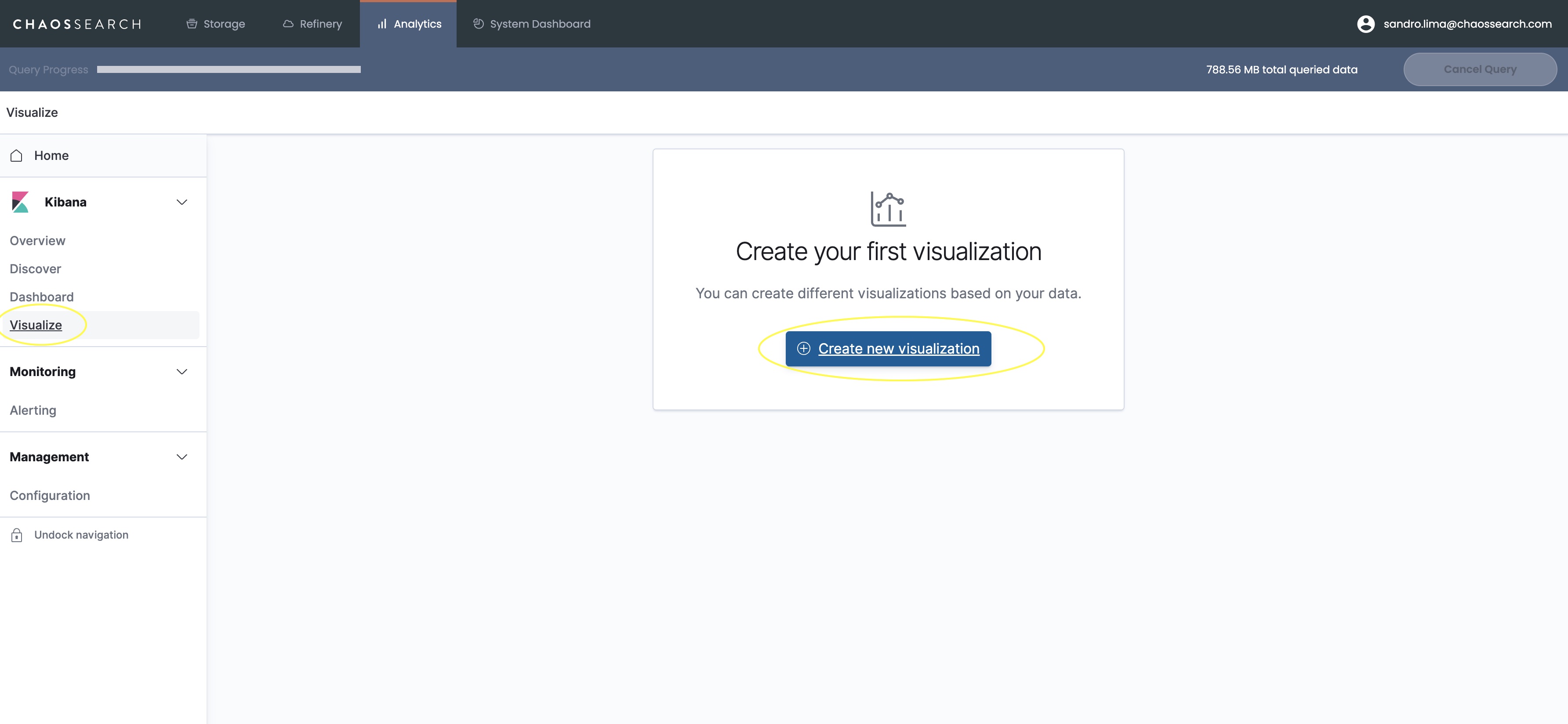
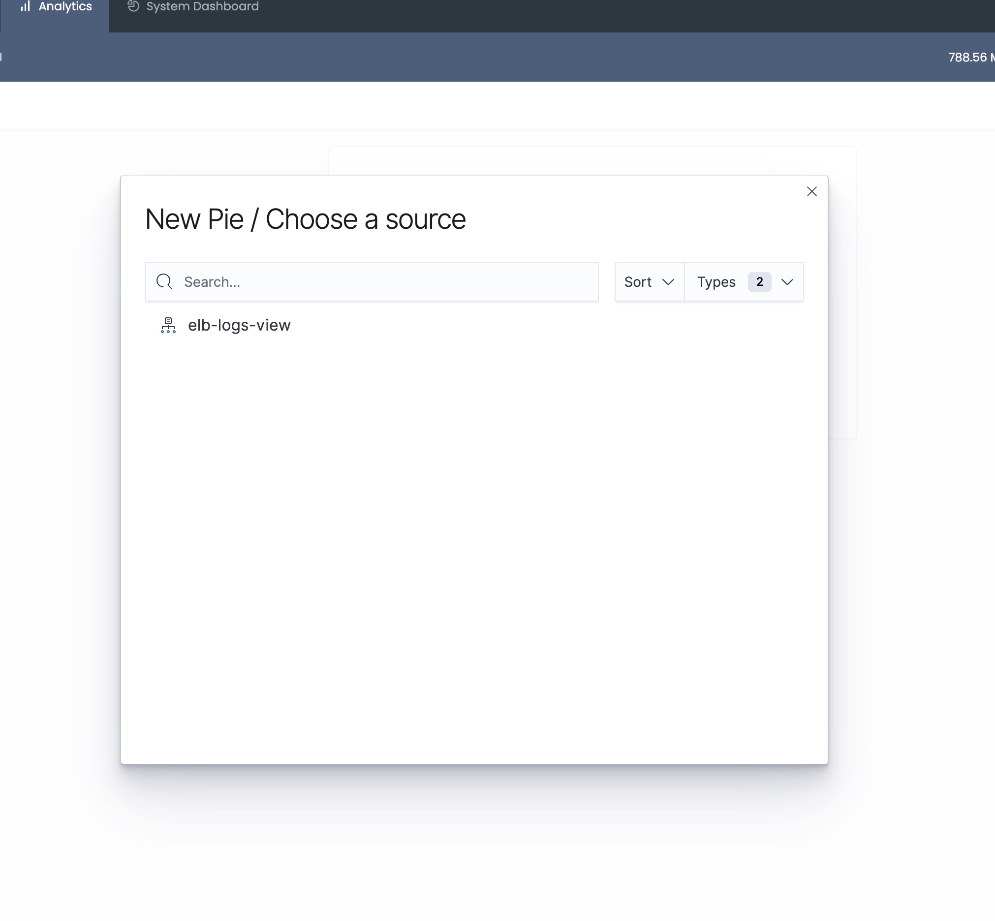
Now let’s create a visualization by clicking on Visualize on the left menu, and then clicking on Create new visualization at the center of the screen.
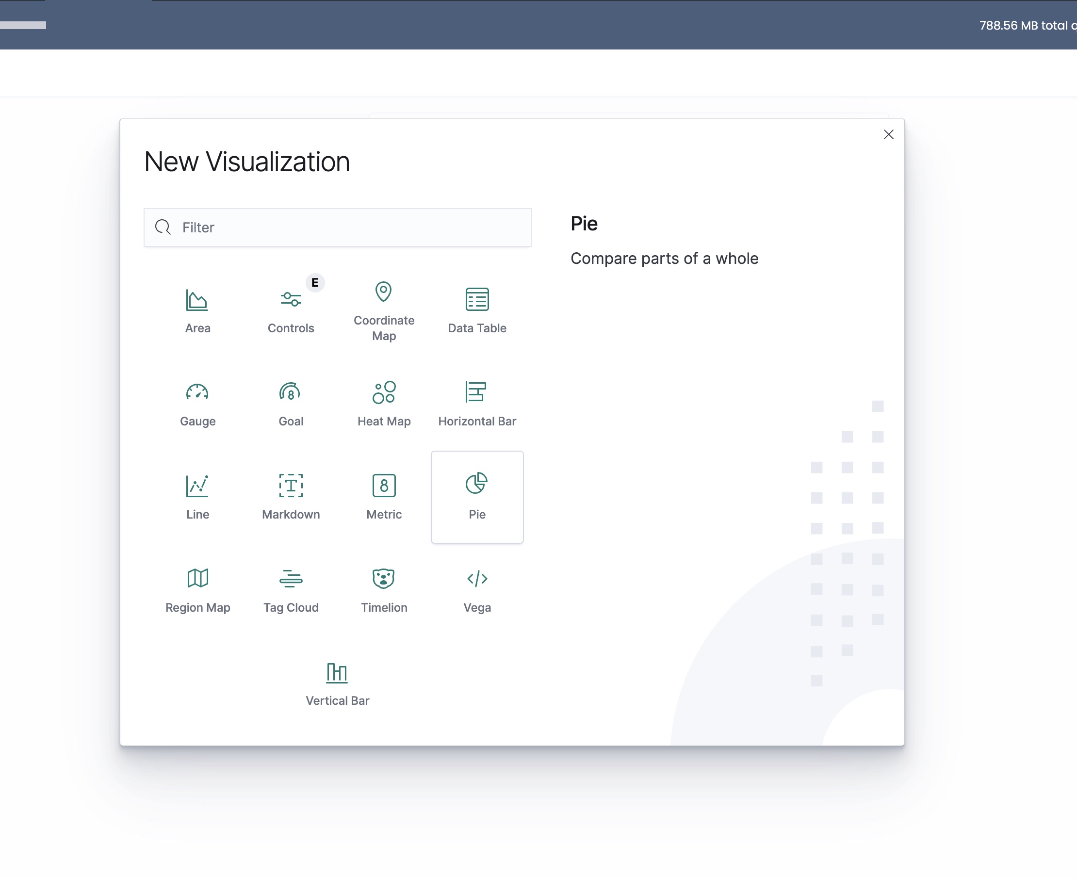
Select the pie chart, then select your View.
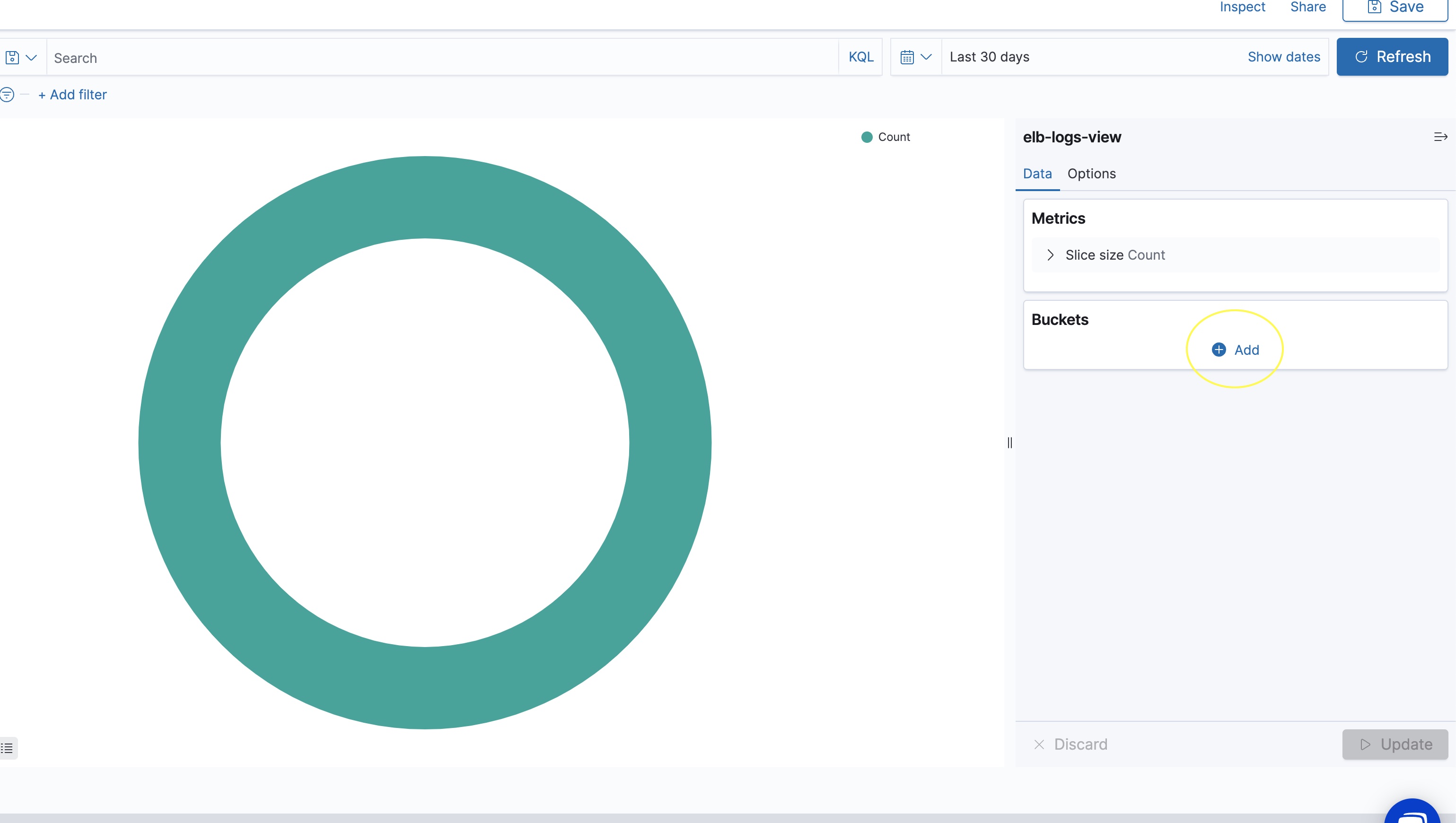
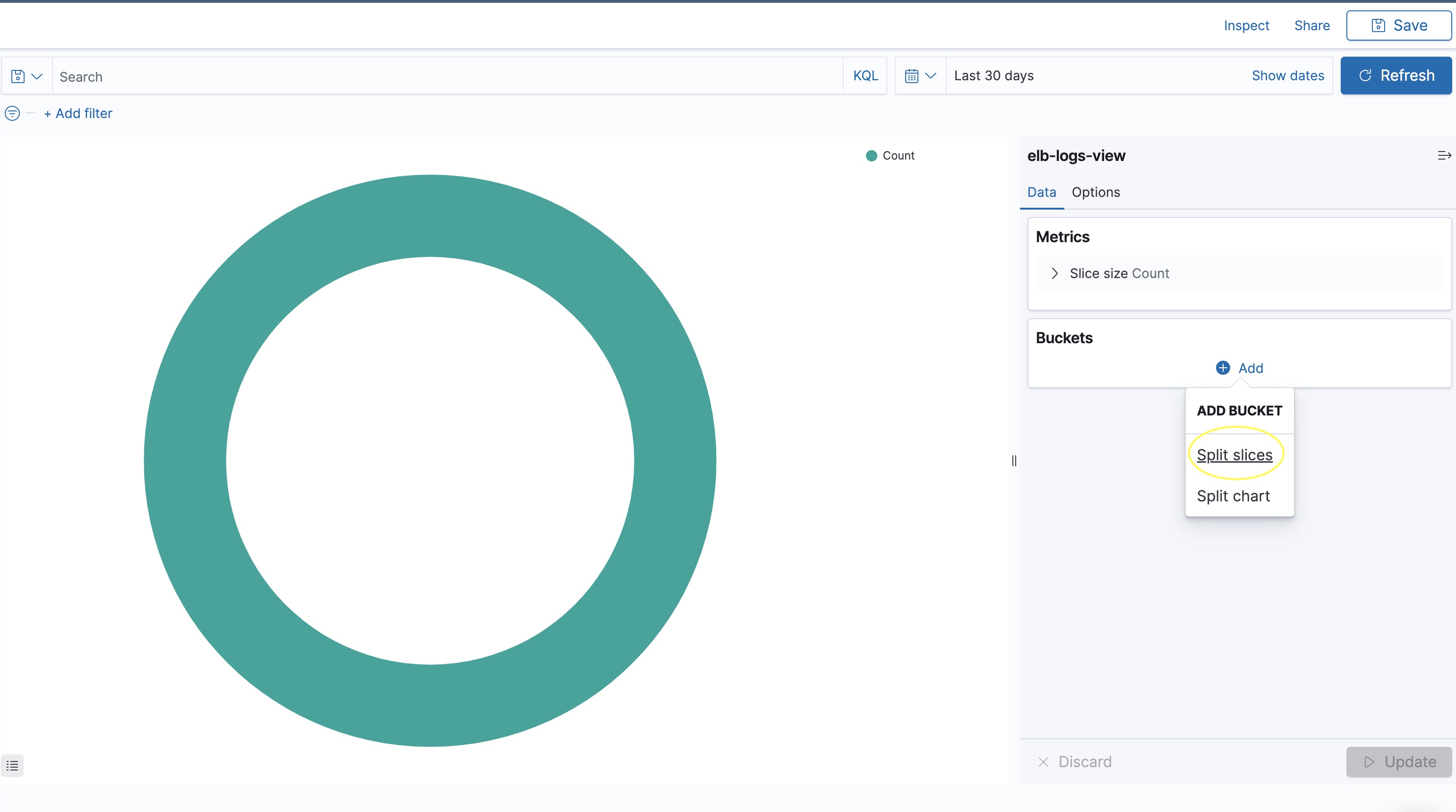
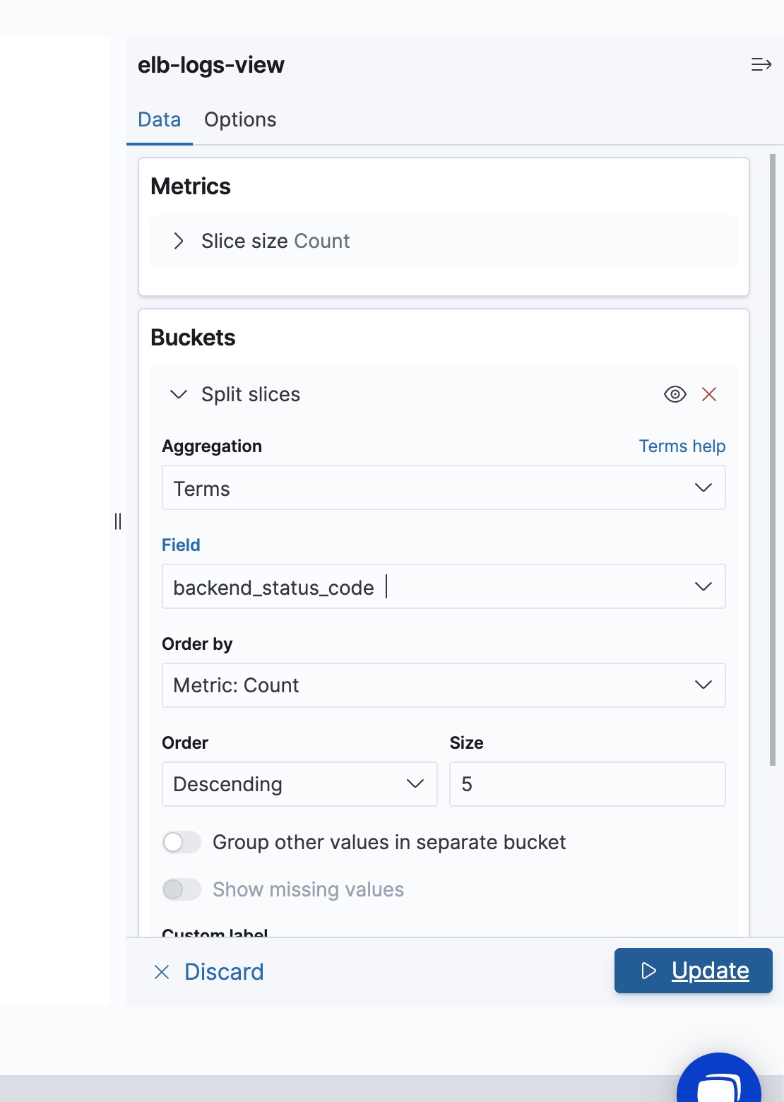
On the right-hand side menu, select Add under the Bucket section, then click Split slices.
Then on the Aggregation drop-down, select Terms
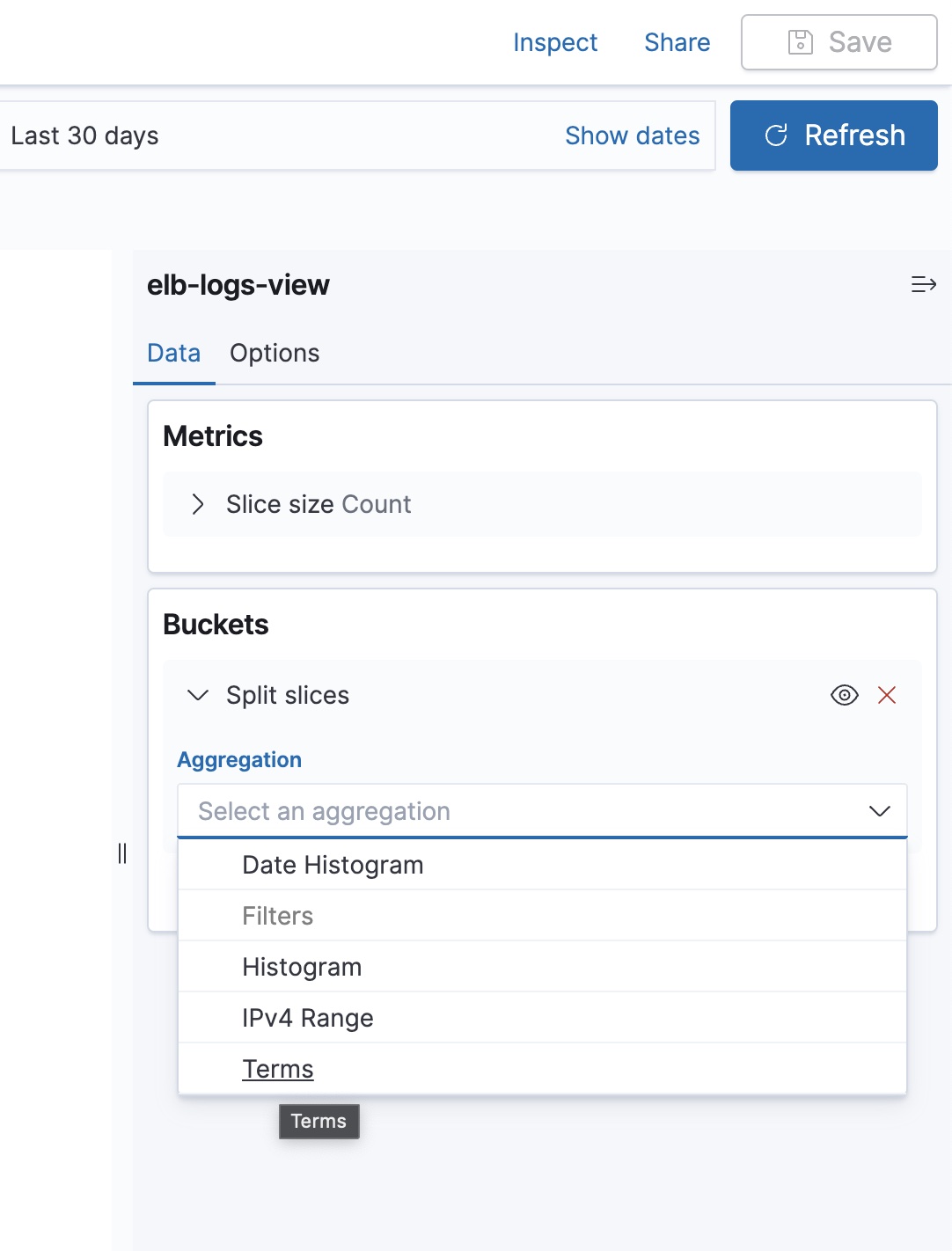
On the Field drop-down, select backend_status_code field, then click Update
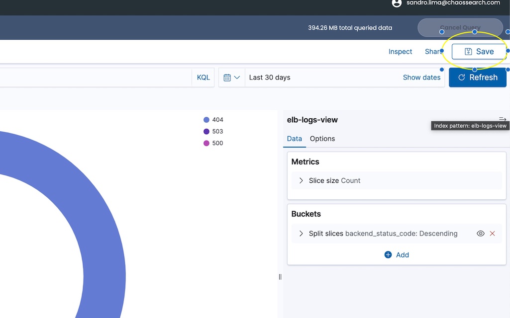
The resulting pie chart shows the top 5 status codes.
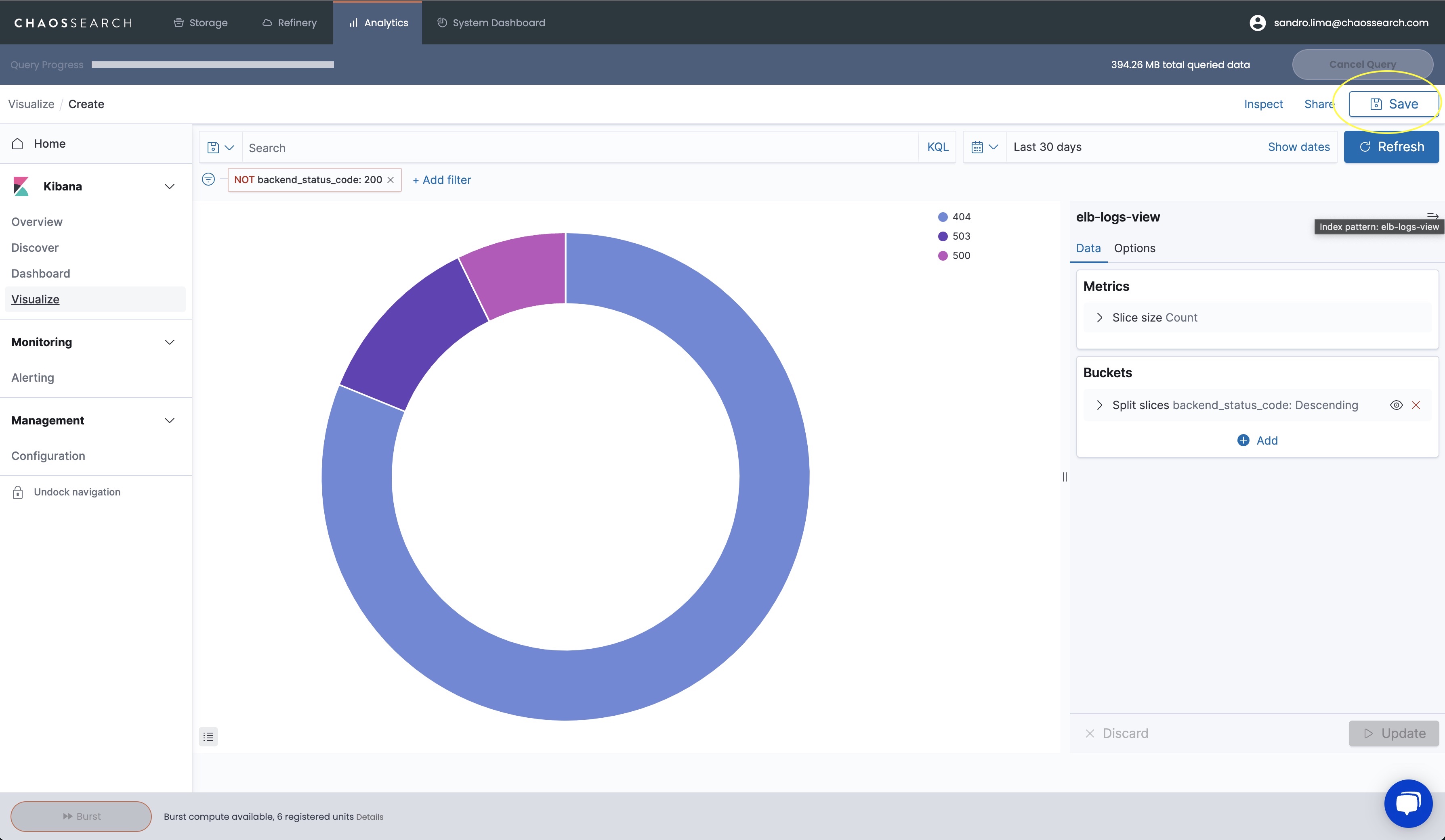
Click Save and provide a name to save the visualization
Tip: Feel free to explore and create other visualization types (metric, bar charts, etc..) and use other fields available.